Product/Wearable Rarity Tiers

With wearable NFTs on the horizon and continued expansion of quality blanks/production – from baseline to high-end custom; good time to identify/unify a Rarity/Tier system for MF products that we can highlight via visual/metadata for the wearables, as well as for the products (visually in the shop as well as on the garments themselves via MF branded hang tags or other small accent pieces when applicable)

Standard RPG-esque gamified approach would be the classic:

  • Rare: Baseline products. Most Open Editions, tees, hoodies, etc. Retail usually capping around the $150 mark.
  • Epic: Collab partner Genesis pieces, Partner Status drops, Kong Chip enabled products, some extra custom components/mechanisms, Limited products ~50 quantity.
  • Legendary: High-custom, maximum clout pieces. MetaGear jackets, multi-collaborative and true fashion innovation/experimental pieces. Usually <50 run.
  • Artifacts: 1/1 pieces. The Genesis Bomber. The holy grail pieces and one-offs.

Follow up would be do we make these Rarity Tier terminologies our own w/ a little memeage, while maintaining a sense of familiarity so one can understand the “hierarchy” of rarity. Ex:
Rare -> LooksRare
Epic -> Dope
Legendary -> Dripindary
Artifact -> Meta

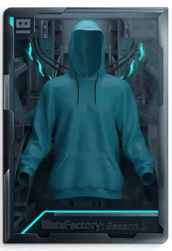
Rarity color scheme/housing and possibly engraved copy for wearable assets could encompass these Rarity Tiers if we solidify a permanent hierarchy to utilize. Then a similar frame could be applied to product clo3d renders to give a saucy zest to the shop listings.

WIP w/ Fraemwerk:
4 Likes

I like this general strategy, maybe we could keep it to 3 tiers instead of 4 (combine epic and legendary) to keep it a bit simpler, otherwise it could result in no one wanting lower tier stuff.

The other approach that I think could be cool is to not name it hierarchically or impose our own view of “scarcity level” on it, but instead just treat it as a flat list of classifications. Like item classes instead of item rarities for the RPG example. e.g. Fire weapon vs poison weapon vs magic weapon, legendary boss weapon with unique moveset vs basic longsword, etc.

Don’t even have to change the qualifiers for each category, moreso about how we portray them as non-hierarchical and let the community / market decide what’s actually valuable. Could end up that one of the “rare” drops ends up becoming ultra valuable for reasons external to us, e.g. the Uniswap shirt because of Hayden wearing it.

Focus it more on being a descriptor of what type of product it is rather than how rare it is. Otherwise it limits us from the culture emerging naturally based on real lived experiences. e.g. for 1/1 or holy grail pieces they can be called “heirloom” pieces, for anything innovating on fashion/construction in a major way it could get a “artisan” label. Things that are 1/1 but a part of a bigger collection (e.g. MetaLoot) could get a “unique” label, etc.

Also in terms of the language/voice we use, probably best to have this “metadata” be more neutral vs using something too meme-y/trendy since those might not age well or might feel out of place for certain products / drops.

Some ideas: heirloom, artisan, unique, limited, etc. The “base tier” doesn’t even need to have any label.

In terms of renders, I think its nice to have for viewing at a glance on marketplaces etc, but the meat of it is in the metadata and how we represent it dynamically in different use cases of people actually interacting with the wearables (AR overlays, in-world item name colours, etc). The aesthetic of the box scene could potentially clash with certain products as well, and especially as we move more towards being an “OS” I think its important to not put too much of our own brand on the “infra/tooling” pieces we build since we want others to make use of it too. The more neutral it can be and focused on the product first the better. I liked the grid logo in corners concept for that reason since the same base primitive could be used for many different styles.

I think a better place for more stylized stuff like this is in the content we create around the products, e.g. making cool reels like this: https://twitter.com/T3tra333/status/1470523230192549894 etc where we can express our brand / identity more freely since its something for just that moment in time vs on the NFT itself which is supposed to last forever

6 Likes

+1 to this entire response lmao, just 90 degree turned my brain and agree across the board. I’d like to go more for the second approach with neutrality on the housing design to keep it composable w/ base primitive design, and emphasis on flat classifications that fit the product over scarcity or qualifiers.

Big fan of Artisan and Heirloom for terms. Which with this second approach we don’t really need to “hard cap” any sort of hierarchy or tier count. Can naturally evolve to fit needs.

Follow ups would be:

  • Would we want these attribute tags to be represented on the visual side in lieu of “MetaFactory: Season 1” on the bottom right?
  • Keep top-left robot, make bottom right a similar blank spot that can slap collab logos or simple symbols on.
  • Pivot the teal blue lighting accent effects to a neutral white light.
  • Any additional thoughts from the class on direction:)

I think we could use different ROBOT faces/colors in the top left to represent the various tiers. Keep it minimal as possible IMO, just enough to provide the utility of knowing what type it is without being in your face / taking attention away from the product.

Bottom right can have Collab logos and then maybe some simple symbols to indicate some other form of metadata if needed (e.g. indicators for zero waste, or Kong chipped, or sustainable / eco friendly / upcycled, etc). but again not super necessary because that will exist in the metadata and people can browse / sort / filter by those traits if needed.

I think in addition to changing the lighting to be more neutral, changing the base style itself to not look like an industrial factory would be good as well. Really pare it down to something more minimal / neutral. Remove as much extra stuff as possible until you can’t remove anything anymore so that anything that’s there is very intentional and with a purpose.

1 Like

agree with MD on tags & flair being better than a strict tier system. wanted to also chime in and say that on the bottom where it says Metafactory Season 1 I believe that we agreed at ETH Denver to either remove that or change to the item name

This is that same first variant, just gotta get fraemwerk direct and more finalized feedback so we’re extremely mindful to not waste his time on 3d asset creation:)

Though was thinking we could possibly have a collection of digital WIPs and dope assets that maybe don’t see the light of day as final versions. Cool way to document evolution of designs and get the creators possibly some additional revenue. (Could be done when relevant on physical design experiments as well. 1/1 prototypes, etc.)

I don’t know where this needs to go, but I can see a t-shirt that reads: “I earned crypto by buying this t-shirt,” with a metafactory something or other print. I can see that as being consistent selling product “advertising” gear for Metafactory that hits that lower tier. Advertises to a new potential base that aren’t involved in Crypto. “Wait, you can earn crypto just by buying a shirt?”

I like this tiered system as an “internal system,” or rather how things are referred to in regards to the level of customization/work involved. I do agree that you need a ladder that shows the customer “oh, this is what I get when I level up my gear.” Or more importantly, what you lose by going for lower tier. Nobody wants to lose anything.

I used to have a job where I would piece together $20-30K packages, and that shit really works. Clearly defining upgrades as a step ladder really needs to be nailed. High developed sales psychology can easily add a shit ton of rev over time.

1 Like

I’d be interested to know if “set bonuses” can be factored into MF merch. Thinking WoW or Diablo armor sets that give you certain stat boosts when you have 3/5, 4/5, or 5/5 pieces… using some sort of system like that on our collections could be dope.

3 Likes